CTA Cards
CTA Cards is a row type used to display CTA style buttons and cards of information on a page.Step 1: Find the Add Block Button
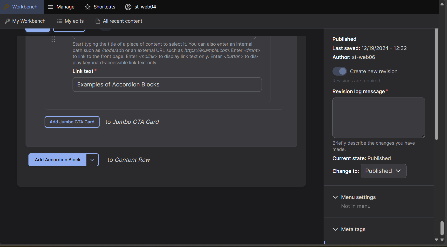
At the bottom of the editing screen select the down arrow next to 'Accordion Block'
Step 2: Add the Row
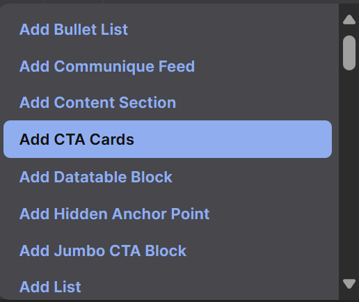
A dropdown menu will appear, select "Add CTA Cards" which will now create a CTA Cards Row on your page.
Step 3: Card Style
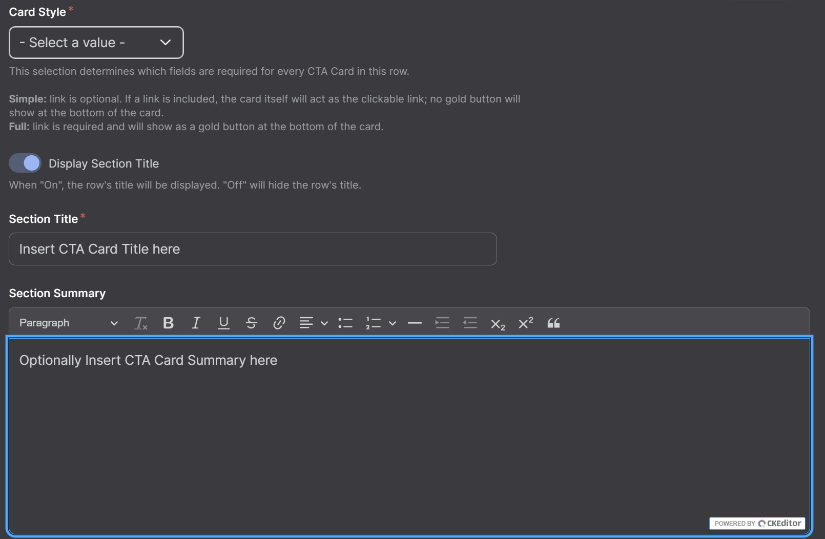
Select a Card Style from the drop-down menu, add a Title and add a Section Summary. A section summary is not required but a title and card style are.
Step 4: Add a CTA Card
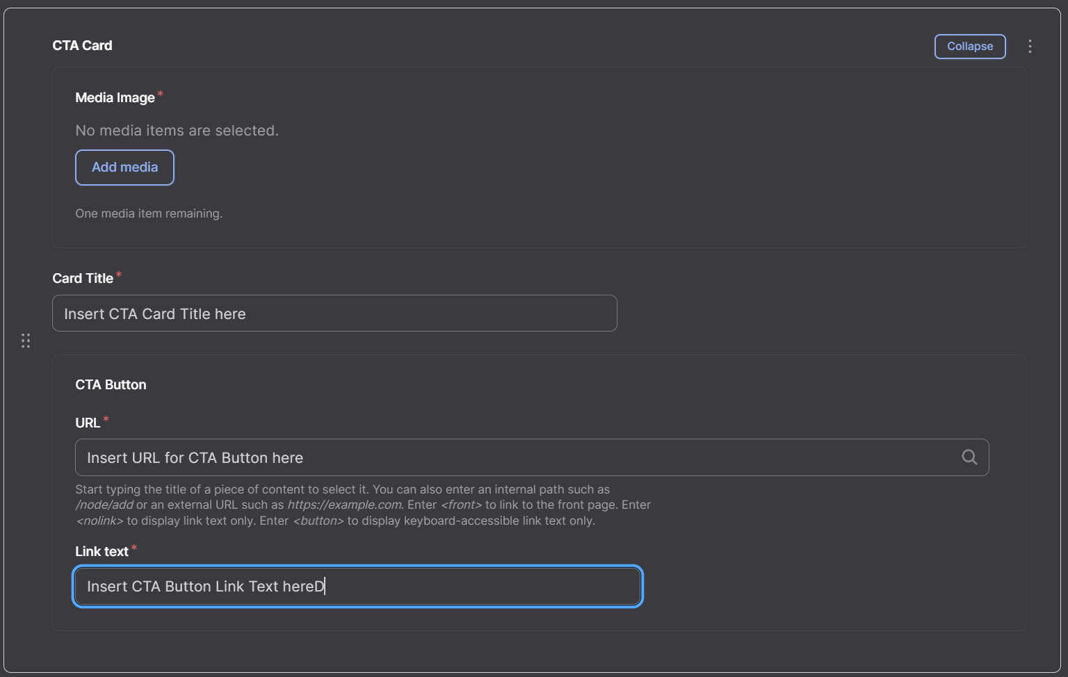
To add a new CTA Card, select Add CTA Card under your current CTA Cards. It is best to keep CTA cards under one row so there are no spacing issues between cards.
Step 5: Deleting or Duplicating the Row
To delete or duplicate a CTA Card, select the Three Dots next to the Collapse button, and select Duplicate or Delete from the dropdown menu.
Simple - Image Card Style
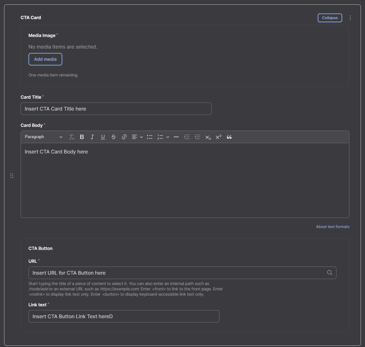
A Simple - Image card style only requires a Card Title, an Image under the Select Image(s) button, and the option of a button redirect. In order to add an image, it must first be uploaded to the media section of Drupal. For instructions on how to do that, and how to upload an image using Drupal go here. You may also create the CTA card as a button, to do this, go to the CTA Button menu, and insert the URL (link to the webpage) of the webpage you would like to redirect to. If the page is under the same domain you can search for it, see here for instructions. The Card Title will not be visible to the user, but the Link Text will.
Simple - Image, Body
A Simple - Image, Body card style is the same as a Simple - Image card style however, it has a Body paragraph that goes under the Link Text. For instructions on how to place this card, view the Simple - Image section above. Additionally, you will add text into the Card Body section as a sub header for your card.
Simple - Text Only
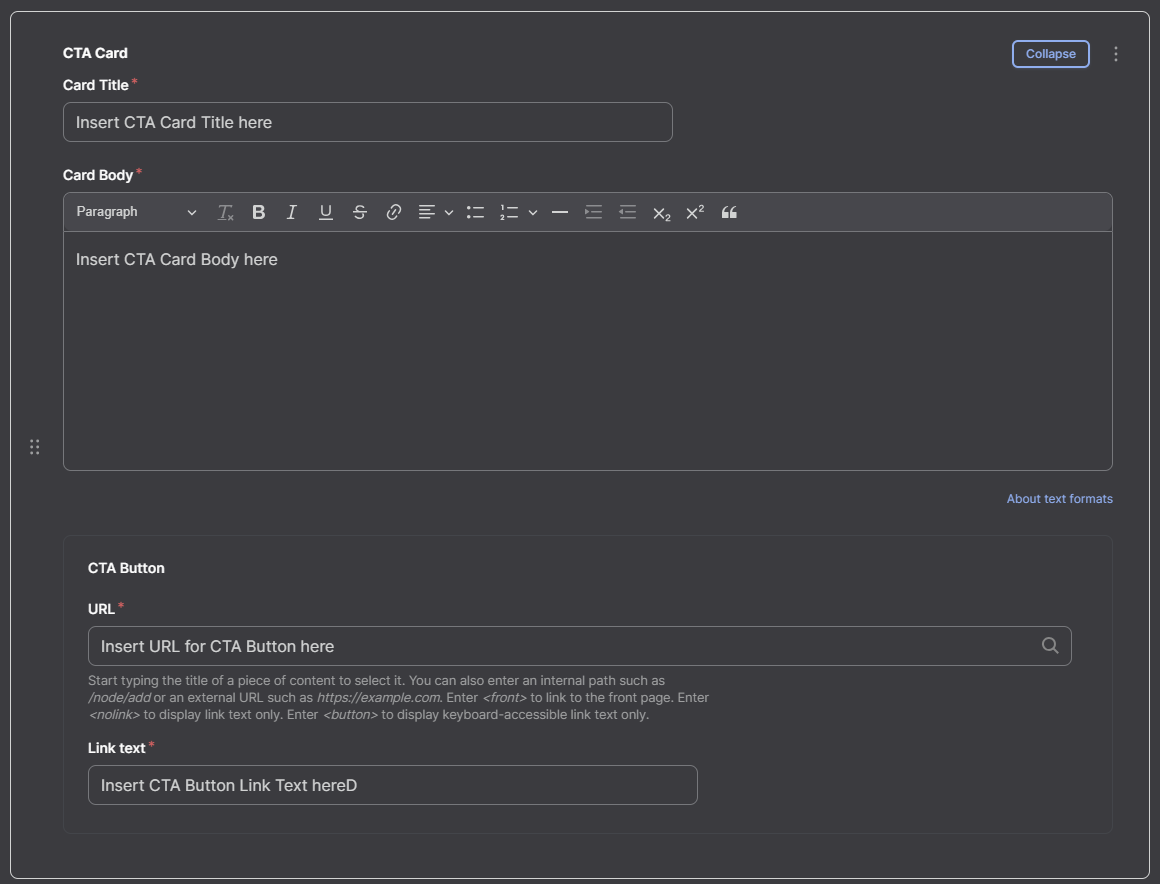
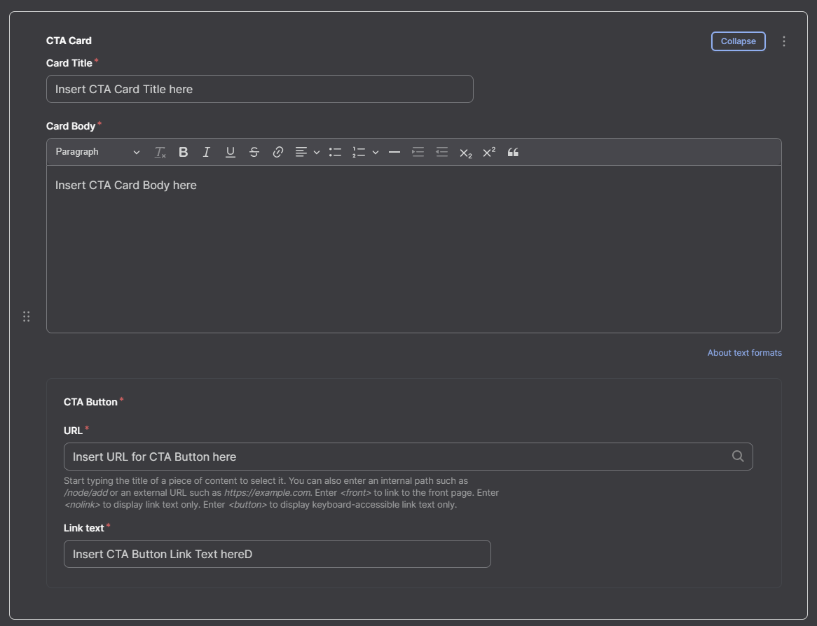
A Simple - Text Only CTA card is the exact same as a Simple - Image, Body CTA card but without an image. For instructions, see above.
Full - Image
A Full - Image CTA cart is the same as a Simple - Image, Body but formatted with a physical button. This is used for cards with longer text in the Body text section.
Full - Text Only
A Full - Text Only card style is the same as a Full - Image card style but with no image.
CTA Cards Video Tutorial
Watch our video tutorial on how to create and use the CTA Cards row.
